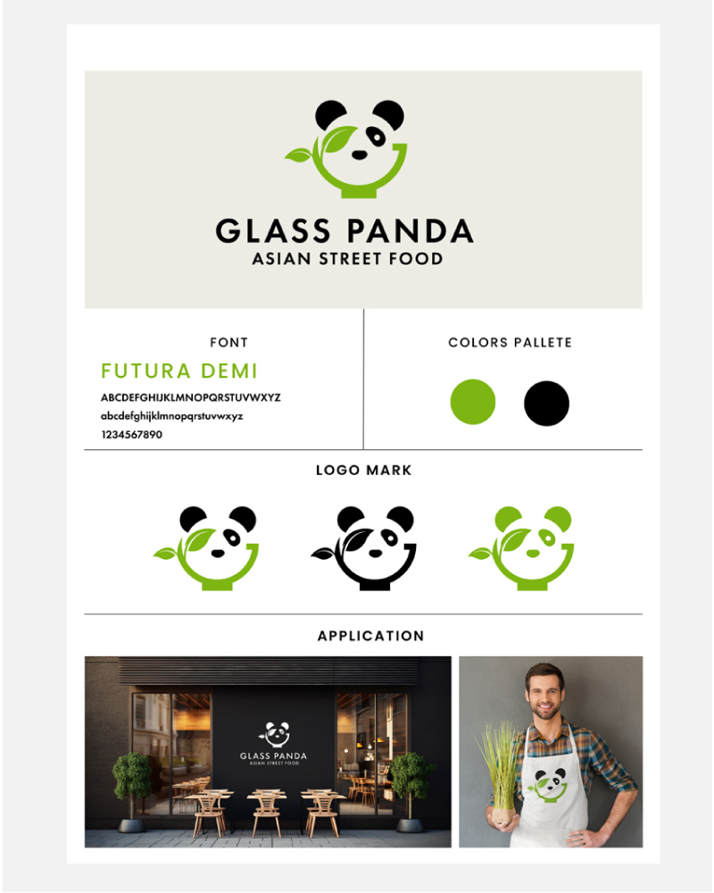
Client: Glass Panda - Logo Design and Branding
Objective:
On the Glass Panda project, my goal was to create a sophisticated and modern brand identity for this Korean restaurant specializing in healthy cuisine. The client stressed the importance of simplicity and elegance, steering clear of typical caricatures and the traditional red and black color scheme. The challenge was to convey the restaurant's commitment to clean and healthy eating.
Research and Analysis:
My initial research delved into Korean culture, culinary aesthetics, and contemporary design trends. Recognizing a market gap for a Korean restaurant focusing on both traditional flavors and fresh, healthy ingredients, I aligned my creative direction with the client's vision.
Conceptualization:
Inspired by the idea of combining modernity with the essence of healthy Korean cuisine, I explored various concepts. The image of a panda, often associated with health and balance, became a central motif. However, we avoided the typical caricature and opted for a sleek, abstract representation.
Design Elements:
1. Panda Silhouette with Leaf: The logo mark comprises a minimalist panda silhouette with a distinctive touch—a leaf covering one eye. This addition symbolizes the use of fresh, natural ingredients and adds an element of intrigue to the design, embodying the essence of healthy eating and balance.
2. Green and Black Color Scheme: Choosing a palette dominated by shades of green, complemented by black for elegance, aimed to evoke freshness and health. This color combination reinforced Glass Panda's commitment to clean eating.
3. Bowl Integration: To tie in the concept of healthy eating and Korean cuisine, I seamlessly incorporated a subtle bowl element into the design. The bowl, integrated into the panda silhouette, reinforces the restaurant's focus on wholesome and nourishing meals.
4. Typography: Opting for a sleek, sans-serif font for the restaurant's name maintained a modern and sophisticated feel. Meticulous adjustments to spacing and alignment enhanced readability and aesthetics.
Application:
The logo and branding elements will be apply across various touchpoints, including menu designs, signage, and digital platforms. Maintaining consistency in the use of the color palette, typography, and the unique panda-leaf-bowl combination reinforced the brand identity, conveying a cohesive message of modernity and healthy dining.
Results:
The Glass Panda logo successfully captured the essence of the client's vision for a sophisticated and modern brand. The distinctive branding, marked by the panda silhouette with a leaf and bowl integration, contributed to Glass Panda's identity, setting it apart in a competitive market.
In summary, this case study highlights how my strategic design decisions, such as integrating a distinctive logo mark, were in harmony with a profound comprehension of the client's objectives and their intended audience. This collaboration resulted in the development of a compelling and effective brand identity for the restaurant.