Client: Australian Zoom Bees - Logo Design
Client Overview:
I recently had the opportunity to work on a project for Australian Zoom Bees, a successful honey production company. The task at hand? To breathe new life into their existing logo, infusing it with simplicity, elegance, and a touch of modernity. Here's how I approached this redesign journey.
Understanding the Client's Vision:
Before diving into the creative process, I made it a priority to thoroughly grasp the client's aspirations. Australian Zoom Bees sought a logo that would epitomize their commitment to quality and tradition, while also resonating with a contemporary audience. They emphasized the importance of simplicity, wishing for a design that could effortlessly convey the essence of their brand.
Conceptualization and Design:
Armed with insights from the client, I started the conceptualization phase. Drawing inspiration from the natural world and the company's product, I envisioned a logo that would merge simplicity with sophistication. The idea of a badge-like design immediately sprang to mind, offering a timeless appeal that would endure through changing trends.
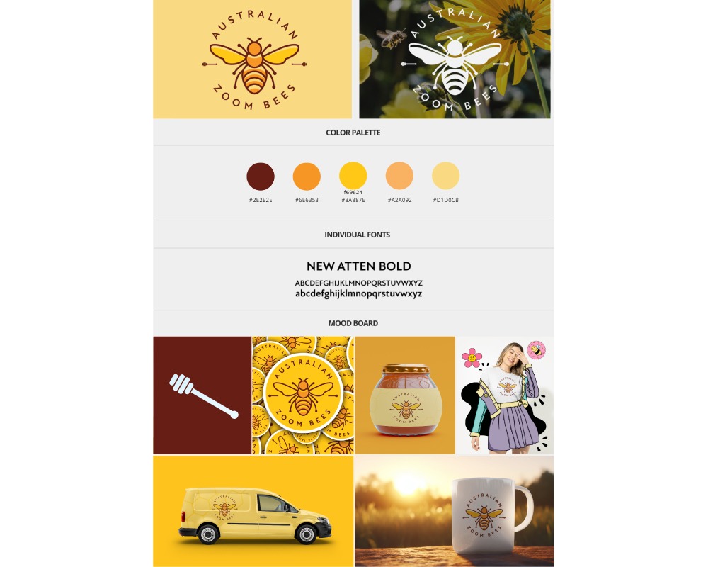
In the center of the badge, I envisioned a simple and modern illustration of a bee – the quintessential symbol of the company's identity. To either side of the bee, I placed two honey spoons, symbolizing the artisanal craftsmanship and dedication that Australian Zoom Bees pour into their products. The arrangement was meticulously balanced to ensure visual harmony and readability at any scale.
Typography and Color Selection:
For the typography, I opted for a clean and modern font that would complement the badge design without overshadowing it. The chosen typeface exuded sophistication while maintaining legibility, a perfect match for the refined aesthetic Australian Zoom Bees desired.
When it came to colors, I drew inspiration from the vibrant hues of honey itself. Yellow and Orange, reminiscent of golden honey, formed the primary color, exuding warmth and positivity. Brown for the typography and the honey spoons, grounded the design, evoking the earthy tones of nature.
Refinement and Iteration:
With the initial design in place, I iterated through several rounds of refinement, fine-tuning every detail to perfection. Each iteration was met with feedback from the client, allowing us to collaboratively shape the logo into a true reflection of Australian Zoom Bees' identity.
Final Product:
After meticulous refinement and collaboration, the final logo emerged – a seamless blend of simplicity, elegance, and modernity.
Conclusion:
In redesigning the logo for Australian Zoom Bees, I had the privilege of translating their vision into a visual identity that captures the essence of their brand. Through a meticulous blend of design elements, typography, and color, the new logo stands as a testament to the company's commitment to quality, tradition, and innovation.