Client: Trike8 - Logo Design, Sticker Making and Printing
Client Overview:
Client Background:
The client, a young rocket maker, possessed an unwavering determination to revolutionize the space industry. Despite his young age, his expertise and enthusiasm for space exploration were evident, fueling his ambition to establish a space program company that would inspire future generations of scientists and explorers.
Design Inspiration:
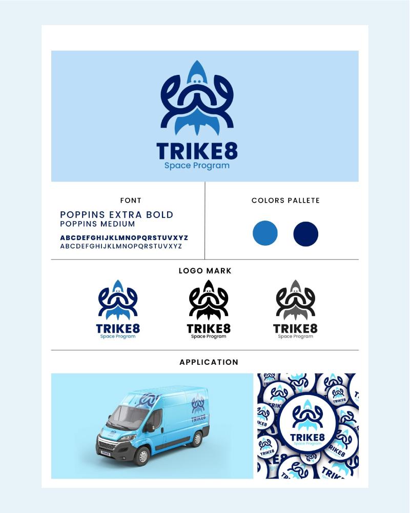
Inspired by the client's fascination with both space exploration and marine life, I sought to create a logo that harmoniously merged these two elements. The challenge lay in seamlessly blending the figure of a crab with the distinctive shape of a rocket, while ensuring the design remained dynamic and visually appealing. Drawing inspiration from minimalist design principles, I envisioned using clean lines to achieve a cohesive and impactful composition.
Design Process:
I began by sketching various concepts, experimenting with different arrangements and proportions to find the perfect balance between the crab and the rocket. After several rounds of refinement, I settled on a concept that effectively integrated the two elements, using intersecting lines to create a unified silhouette that was instantly recognizable and memorable.
Color Palette and Typography:
To evoke a sense of wonder and exploration, I opted for a vibrant color palette dominated by shades of blue and light blue. These hues not only alluded to the vastness of space but also echoed the colors commonly associated with marine environments, subtly nodding to the client's affinity for marine life. For the typography, I selected a clean yet bold font that complemented the sleek lines of the logo, exuding professionalism and confidence.
Sticker Making:
In addition I printed, and cut with a professional plotter, vibrant stickers using the logo. These durable stickers were stuck on every rocket, and they were use as marketing giveaways. Crafted with high-quality materials, they sparked curiosity and reinforced brand recognition within the space community.
Final Outcome:
The culmination of our collaboration resulted in a striking logo that surpassed the client's expectations. The fusion of the crab and rocket seamlessly captured the essence of the client's brand, symbolizing innovation, resilience, and the limitless possibilities of space exploration. The use of bold lines and vibrant colors ensured the logo stood out across various platforms, from digital screens to merchandise and beyond.
Conclusion:
In conclusion, the journey of designing a logo for a teenage entrepreneur's space program company was both rewarding and inspiring. By harnessing the power of design to translate his vision into a tangible reality, we succeeded in creating a distinctive visual identity that would serve as a beacon of inspiration for generations to come. As the client prepares to embark on his entrepreneurial odyssey, I am honored to have played a part in shaping the trajectory of his future endeavors.